Saturday, November 20, 2010

Day 51

Jim showed us this great book


WHAT I DID

  • Printed my band postcard
  • Printed my pangram poster
  • Received my internship completion certificate
  • Saw a very cool printmaking book for kids

Pangram poster preview


WHAT I LEARNED
  • Because it's so thick, cutting chipboard a little shorter can keep it from catching around the cylinder when printing
  • Roll posters along the grain of the paper so that they will stay flat later


THE END

This officially concludes my internship, but I will post pictures of waiting-for-the-release-date posters and finished personal Hatch projects as the time comes


Internship complete


Thursday, November 18, 2010

Day 50

So many rules


WHAT I DID
  • Set postcard designs, the Evil Hatch Clown and a small version of Luana poster
  • Sorted out rules (of the tangible, letterpress variety) in search of the perfect one for my postcard
  • Finished setting a band postcard for personal project
  • Proofed some Christmas card designs for the Country Music Hall of Fame
  • Found out my postcard client is going to be having some logo changes, so the job was put on hold indefinitely; I was really excited about this design, but I imagine many good designs never get seen because of situations like this

Part of my postcard which may not actually get printed (but you can see the film blocks I carved in printed form!)

WHAT I LEARNED
  • If you want to "stamp" type during the proofing process, it's best to put a piece of foam core or something cushy underneath so that you get a good print; the softness allows the type to print more evenly

Wednesday, November 17, 2010

Day 49

My poster at the Loveless Barn (mine is on the left, Brad's is on the right)


WHAT I DID
  • Printed some retail posters (got to cycle through several colors– so much fun!)
  • Worked a little on typesetting a postcard for myself
  • Went to see Music City Roots at the Loveless Barn– very cool to actually see it after working on their poster


WHAT I LEARNED
  • When cycling colors on the press, it's easy to go to darker values, but much harder to get lighter. Ex: if I tried to print yellow after blue, I'd probably have to clean the rollers or I would just keep getting green.
  • Uneven rollers can cause loads of printing problems; if there's obviously nothing wrong with your type and things are printing funny, this could be the cause
  • A dirty press bed can also be the mystery cause of printing problems

The aftermath of printing today

Tuesday, November 16, 2010

Day 48

WHAT I DID

  • Trimmed down Grant/Gill posters and bagged them for client
  • Called Sunday Morning Films client about postcard, waiting on approval
  • Worked a little on personal projects


WHAT I LEARNED
  • Always remember to include a Hatch tagline on your projects
  • Print your poster a few times before bumping up type; sometimes it takes a few runs for the type to settle correctly
  • My Christmas cards are in the Hatch online store now!


NEW PRINTS

Here's some of my favorites from the baby announcements I did this weekend on a variety of makereadies.


Monday, November 15, 2010

Day 47

Trim mark. You can see the grip marks on the edge of the paper, about to be trimmed off.


WHAT I DID

  • Trimmed Lhoist posters and bagged them for customer
  • Printed 300+ backgrounds for Vince Gill/Amy Grant poster
  • Printed 300+ second color for Gill/Grant posters
  • Pulled a proof of my pangram side project


WHAT I LEARNED
  • Getting better at gauging the right quantity of ink for a job– still not perfect however, I tend to mix too little
  • We have a handful of ink colors to start with when mixing a new one. Mixing color with Warm Red vs Rubine Red makes a HUGE difference in color

Saturday, November 13, 2010

Day 46

Type for baby announcement


WHAT I DID

  • Saturday workday! At this point we're allowed to come in on the weekend and work on personal projects
  • Set type for a baby announcement for a friend
  • Printed baby announcement on a variety of makereadies
  • Set type for a pangram poster


WHAT I LEARNED
  • Paper, like wood, has a natural grain– it's best to print with it rather than against it
NEW POSTER

Now that's it's safely past the show date, I can post this one. I printed a couple of these on makereadies and realized I liked the makeready version a bit better!

Official Tootsie's poster

Tootsie's poster printed on a yellow sunburst makeready

Friday, November 12, 2010

Day 45

Alco Graphics– lens flare not intended, I promise


WHAT I DID

  • Picked up Lhoist logo plate from Alco Graphics
  • Got confirmation for Vince Gill/Amy Grant poster
  • Separated colors for Gill/Grant poster
  • Printed second color for Lhoist poster


WHAT I LEARNED
  • DO NOT bring the cylinder on the back press back too early; it will annihilate your poster! 

Thursday, November 11, 2010

Day 44

Inking up a gradient block


WHAT I DID
  • Printed Lhoist background block, a gradient in blue
  • Watched the Veteran's Day Parade

This guy was giving it his all during the Veteran's Day parade


WHAT I LEARNED
  • When printing background blocks (especially warped ones), it is often better to not tighten the quoins so that the block has room to move as it is inked/printed
  • When printing a solid background, it is smart to center the block as much as possible on the page so that you have lots of room to play with the trim of your poster
  • With gradients, you must pay attention to where one color starts and another stops, and also how smoothly they are blending. I've seen color areas marked off to the side with tape in lithography/silkscreen setups in order to keep things consistent; I imagine you could do the same with letterpress.
  • Constantly keep an eye on gradients as you're printing, they easily become inconsistent

Wednesday, November 10, 2010

Day 43

Whole bunch of ands, all in a row


WHAT I DID
  • Cut a couple linoleum blocks  of film strip borders for Sunday Morning Films postcard/finished setting type
  • Pulled proofs for postcard, front and back
  • Called client to discuss faxing the proof; realized the client was expecting a call before the design was even started!
  • Mixed colors for Lhoist poster background
  • Got surprise free tickets to the CMA Awards– most importantly, got to see Loretta Lynn in person!

Us in CMA attire, Brad @ press

Carving film blocks

WHAT I LEARNED
  • Always touch base with your client before beginning a design; you never know what has changed since they placed their order (there has been a 5-7 week wait time for production during my stay)
  • How to use a proportional scale (in this case, to know how much to shrink down a logo when making new magnesium plate)

Meet proportional scale

Tuesday, November 9, 2010

Day 42

Brainstorming image ideas


WHAT I DID

  • Put away type
  • Got a new job– a postcard for Sunday Morning Films, a short film company
  • Researched client/sketched out ideas for imagery
  • Started setting Sunday Morning Films postcard

This will probably be making an appearance in the postcard


WHAT I LEARNED
  • Practiced setting a smaller format
  • Standard postcard size is 6"x4.25"

Monday, November 8, 2010

Day 41

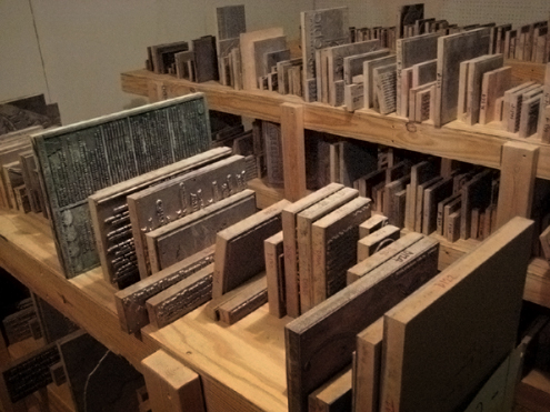
New batch of archived plates


WHAT I DID

  • Archived some plates that were finished being printed
  • Finished setting Vince Gill/Amy Grant poster
  • Proofed Vince poster
  • After work, but sort of related: Went to see The Time Jumpers at Station Inn and was surprised to find out that Vince Gill was playing with them– I'll consider it research.

Shelves upstairs

WHAT I LEARNED
  • How to properly archive plates
  • How the plate system upstairs is organized
  • I'm a Vince Gill fan!

Friday, November 5, 2010

Day 40

Hair cut time in the back today


WHAT I DID

  • Put trim marks on the Bluebird posters
  • Got a new job– Vince Gill & Amy Grant's 12 Days of Christmas at the Ryman
  • Got asked a surprisingly hard question– what color to print next on a red Santa poster? Per Brad's recommendation (and a lot of doubt on my part), the result was purple!
  • Printed some red and purple Santa posters

The surprisingly awesome purple

WHAT I LEARNED
  • Purple and red work surprisingly well together, even in a Christmas situation
  • Learned this a while back, but totally worth pointing out: the spacing underneath an "N" is larger at the bottom than on top; they are very often placed upside down

Upside-down N alert!

Thursday, November 4, 2010

Day 39

Printed this little guy today


WHAT I DID

  • Finished the Bluebird Cafe posters– printed 400 in 2 hours! One of my favorites so far, pictures to come once I get approval and such
  • Printed for almost exactly the same length of time it took to listen to Bob Dylan's Theme Time Radio Hour #32 (The Moon) and the Essential Bob Wills


Inside the toolbox of a man they call Danner


WHAT I LEARNED
  • Every little thing can make a difference when it comes to how fast you can print– I inked way less during this color, so I printed faster, but I had workups every few inkings, so that slowed me down a little bit. 
  • Even something small, like moving your stack of paper closer to where it gets grabbed by the press can save a lot of time in the long run (especially with large quantities!)

Wednesday, November 3, 2010

Day 38

Inevitably, I get these track marks from the press on me when printing– EVERY TIME


WHAT I DID

  • Printed the second color for Bluebird cafe posters
  • Set up press and did makeready for the final Bluebird color
  • Did a mini intern interview with Bethany for a presentation Jim will be doing at Wayzgoose, a printmaking gathering held at Hamilton


WHAT I LEARNED
  • When setting up your posters to print on the press, if you keep a couple picas extra at the top, you can trim off the "bite" marks the press leaves when it clamps in your paper
  • One of the intern questions was "What do you plan to do with your Hatch experience?" and my gut answer was "Start a small independent print shop." Now that it's on tape (or SD card, rather) I'm pretty sure I'm held to it, right?

Tuesday, November 2, 2010

Day 37

Been hanging out with this guy all day


WHAT I DID
  • Started color separating Bluebird Cafe posters
  • Printed background block for Bluebird Cafe posters

How much ink does it take to print a full-sized background block on 400 sheets of ink-thirsty chipboard? Well, a little more than this much.


WHAT I LEARNED
  • How to operate at top speed on the back press
    • The longer you print, the faster the press will move
    • If the press moves too fast, it will slam as it hits the end of the press
    • To prevent slamming, bring the cylinder back before it reaches the end of the press
    • Because the brakes are currently out of whack, you can also "manually" break the press by holding onto it as it comes back
  • Chipboard tends to curl back and get caught on the cylinder; you can catch it yourself if it starts to do this

Monday, November 1, 2010

Day 36

You can see where cracks are forming in this old 5

WHAT I DID

  • Mixed inks for Tootsie's
  • Printed the second color of Tootsie's poster
  • Repaired some very old and brittle '5's


WHAT I LEARNED

  • The more paper you put under type to bump up the pressure, the bigger chance there is for workups
  • How to deal with fragile type
    • First off, be aware of any fragile areas as you print
    • There is only so much you can do about fragile type; you can't prevent all splintering
    • If a large section cracks off, it is sometimes possible to repair it by using wood glue then weighing it down as it dries
    • Lighter, lower quality wood can be a prime candidate for splintering and cracking

Friday, October 29, 2010

Day 35

Image from SVC poster


WHAT I DID

  • Printed 200+ posters of the last color for SVC Seattle (a job started by Amy, a short-term intern/visiting artist)
  • Printed 200+ posters of my Tootsie's poster– so much lavender!
  • Listened to Welcome to Little Milton at least 3 times through while printing
  • Listened to Essential Jerry Reed at least twice– good working music is essential

WHAT I LEARNED
  • If you don't wait long enough for the ink to distribute after inking your rollers, you can end up with a noticeable banding pattern in large areas– no good!
  • Printing on coated paper makes a huge difference in ink consumption

Thursday, October 28, 2010

Day 34

Many shades of lavender, but which?


WHAT I DID

  • Walked down to Tootsie's with a Pantone book to color match the bricks– so nerdy
  • Challenge! One more name added to Tootsie's poster, lots of time spent trying to miraculously squeeze it in
  • Mixed color for the bricks– printing starts tomorrow


WHAT I LEARNED
  • The bricks of Tootsie's Orchid Lounge are approximately Pantone 2645C
  • Some VERY helpful information about the internship process. Bethany told us about her process today and I feel like she works so hard and goes about intern selection in completely the right way. I feel like these tips are general enough to be consistent for most internships, and super helpful:
    • Stay in touch– if you interview months ahead of intern selection time, send a card or more recent work sometime in between to let the company know you're still interested
    • Keep a good attitude, especially during interview– it's the first (and an important) impression that your employer has of you
    • Thoughtful and well put-together mini portfolios are not (believe it or not) just a tedious exercise for graphic design class. They're actually very helpful in showing your work (and knowing that you care about it)
    • Why should you get the internship position? Make sure your intent is clear, and show how much an internship will benefit you; you should show that you are eager and willing to learn.

Wednesday, October 27, 2010

Day 33

Loaded this up onto the front press today


WHAT I DID
  • Got a new job– Lhoist Christmas party poster at the Country Music Hall of Fame (they are a limestone company)
  • Called client for input, started setting Lhoist poster
  • Watched Bethany get filmed by American Idol– they are doing auditions in town and wanted to get footage of their Hatch poster being printed
  • Tried not the think about the fact that Steven Tyler (an Idol judge this season) was probably just a block away at the Ryman


WHAT I LEARNED
  • Even a limestone company's Christmas party poster deserves to be cool– got some experience trying to design something fun and interesting for a different kind of client

Tuesday, October 26, 2010

Day 32

Lots of A's to choose from


WHAT I DID
  • Reset Tootsie's poster to include more artists
  • Reset Tootsie's poster again to include more artists
  • Pulled a better proof for Bluebird Cafe


WHAT I LEARNED
  • More practice at dealing with lots of type in a small space– used more condensed fonts, a smaller line height, and rearranged some names to balance out the justified lines

Found this video I took of the Music City Roots poster being printed

Monday, October 25, 2010

Day 31

The most puzzle-like thing I've set thus far

WHAT I DID

  • Worked on Bluebird Cafe poster, pulled a proof
  • Worked on Tootsie's poster– set a wall of bricks made out of upside-down type

Nick found this gem today– toe touch!


WHAT I LEARNED
  • When selecting type to print upside down, choose type with a shiny or patina'd back– newer or more porous type will soak up the ink and not print well
  • If you pull an unsatisfying proof, it's not a bad idea to use some manual cut and paste to rearrange things

Two 45s and a wooden spoon

Friday, October 22, 2010

Day 30

Today's post is dedicated to good lookin g's

WHAT I DID

  • Got approval for Tootsie's poster, waiting on content confirmation to print
  • Started on design for The Bluebird Cafe 2011 poster– 3 colors!
  • Set most of Bluebird Cafe poster
  • Spent a lot of time checking out larger wood type in search of the perfect letter/ornament combinations

Super squat g

WHAT I LEARNED
  • How to think about designing with 3 colors (which for some reason, is harder than it seems.) Create a solid design first without any color separations, then think about how you can begin to break things up with color

Super skinny g
Oblique g– it's actually slanted!


Thursday, October 21, 2010

Day 29

POSTERS!

So the rule is I have to wait until after the day of the event to put any of the Hatch posters I make online. Which means I can finally put some of my posters on here (and there is now a link in the right sidebar to keep track of all the posters)

A small run of posters for Carrie Underwood and crew for her Bridgestone performance.
Poster for the Music City Roots radio show, fall 2010 season.

A poster for the opening of Mzungu, a social documentary about Africa.

WHAT I DID
  • Called Tootsie's client, waited for proof approval
  • Put away type, learned some new typefaces


WHAT I LEARNED
  • New font – Rock

Wednesday, October 20, 2010

Day 28

Up the ladder
Fresh crop of fives– which to use? There is a clear winner.

WHAT I DID

  • Typeset first color of Tootsie's poster for proofing
  • Pulled a proof of Tootsie's poster
  • Climbed the ladder a lot in search of the perfect oversized '5'


Incurred minor injury while digging through box of sharp things– luckily,  Hatch has this handy


WHAT I LEARNED
  • Often, we flip pieces of type over to print solid rectangles. Tips for this:
    • Try to pick characters in which all corners make contact (for example, an 'E' would make contact, but an 'F' wouldn't, so it would print unevenly
    • Select pieces of type that have a surface that will print well (blocks with a shinier surface, or ones that have been printed on the back before)

Proofing the 45 block